How can professional web design enhance your brand identity and trust?
A business owner spends months perfecting a product, polishing the offer, and planning the launch. Then someone visits the website for the first time, stays for a few seconds, feels unsure, and leaves. That moment happens more often than most brands realize. In many cases, the problem is not the service. It is the way the business is being presented online.
People do not meet your company in a boardroom first. They meet it on a screen. They see your homepage, scan your navigation, notice your colors, read your headlines, and decide whether you feel reliable enough to trust. That decision happens fast, and first impressions influence how people judge relevance, credibility, and even usability.
That is why choosing the right direction for your website can feel confusing.
Should you use a DIY builder or hire a team
Should you focus on branding first or conversion first
Should the site feel artistic, corporate, modern, premium, or simple
Should you invest in custom work, WordPress, Shopify, or a more tailored build
Should SEO come after design or shape the structure from day one
A lot of business owners go looking for answers and end up reading shallow advice. One article says design is about colors and typography. Another says speed is everything. Another talks only about CTAs. Real websites do not win because of one isolated fix. They win when brand, trust, UX, content, speed, and search visibility all support the same goal. That is where many current articles stop too early, and that is the gap this guide is here to fill.
If you are trying to find a website design and development company near me, this guide will help you think more clearly before you spend money. It will also help you understand what a strong web design partner should actually do for your brand, beyond making things look nice.
A professional website should do five things at the same time. It should make your brand recognizable. It should make visitors feel safe. It should guide them toward action. It should work beautifully on every device. And it should give search engines enough clarity to understand what your pages are about. Google’s own SEO guide describes SEO as helping search engines understand content and helping users decide whether they should visit your site from search. That idea matters because good design and good SEO are not separate jobs anymore.
How to incorporate branding into your modern web design process?
Branding should not be painted on top of a finished website. It should shape the website from the beginning. When branding is added too late, the site may look polished but still feel generic. When branding guides the process from day one, the site becomes much easier to recognize, trust, and remember.
The first step is to define what your brand should feel like before deciding how it should look. A law firm may need to feel calm, credible, and precise. A fashion brand may need to feel bold and editorial. A health brand may need to feel clear, supportive, and easy to understand. If you skip this emotional foundation, you end up choosing colors and layouts based on taste instead of strategy.
Once the emotional direction is clear, turn it into a visual system. That includes your color palette, typography, button styles, spacing, icon style, image treatment, and content rhythm. A strong brand website does not just repeat a logo in the corner. It makes every part of the experience feel like it belongs to the same company.
Here is where many businesses go wrong. They think branding means only logo use and colors. In reality, branding also lives in navigation labels, headline style, photography choices, testimonials, error messages, and even the tone of your contact form. If your homepage feels premium but your service pages feel dull and generic, trust breaks. If your visuals feel modern but the copy sounds stiff and outdated, trust breaks again.
That is one reason custom structure matters. A thoughtful team working on wordpress website design and development can build reusable page patterns that keep your brand consistent across service pages, landing pages, blogs, and lead generation funnels. That kind of consistency makes the brand stronger over time.
A modern branding led design process usually works best in this order:
-
Brand positioningDefine audience, promise, tone, and market difference.
-
Messaging frameworkClarify what you do, who you help, and why people should care.
-
Visual systemBuild colors, type, layout rules, image direction, and component style.
-
Content structureMap homepage, service pages, proof sections, FAQs, and contact flow.
-
UX planningDecide what users need to see first, second, and third.
-
Design executionTurn the strategy into page designs that feel distinct and useful.
-
Development and testingMake sure the experience stays strong on real screens and real devices.
Branding also needs to match the stage of your business. A small service company should not copy the style of a giant tech platform if that style makes the business feel cold or hard to understand. In the same way, a premium brand should not use crowded layouts and low quality stock images that make it look cheaper than it is. Good branding is not about chasing trends. It is about matching perception with value.
You also need brand proof, not just brand style. People trust what they can verify. So your website should connect visuals with signals that reduce doubt, such as clear service explanations, real case studies, updated content, client feedback, company details, and transparent next steps. Nielsen Norman Group notes that trust is shaped by design quality, upfront disclosure, comprehensive and current content, and connection to the rest of the web. That is a useful lens for modern branding because it shows that trust is built by both appearance and substance.
A simple test can help here. Open your homepage and ask:
Does this look like us or like a template
Would a stranger understand what we do in five seconds
Do the words and visuals feel like they came from the same brand
Do all pages feel connected
Would a serious buyer feel safe taking the next step
If the answer is no to even two of those, your branding is not fully integrated yet.
Why should I invest in professional web design services over DIY?
DIY platforms have a place. They can be useful for testing an idea, launching a temporary page, or getting a first version online when budget is tight. But once your website becomes a real sales asset, DIY often starts showing its limits.
The biggest problem with DIY is not that it looks cheap every time. The bigger issue is that it rarely solves the whole business problem. It may give you a decent looking page, but it will not automatically fix weak structure, confused messaging, poor trust signals, thin content, clumsy mobile layouts, weak page speed, or missing SEO foundations.
Professional design is worth the investment because it combines decisions that casual tools usually leave disconnected. It aligns business goals, audience behavior, brand direction, content structure, development quality, and search visibility. Google’s page experience guidance also makes it clear that success comes from the overall experience across many aspects, including mobile usability, security, clear main content, and strong Core Web Vitals. Not one isolated design trick.
When someone searches for a web developer near me, they are often not just buying code. They are buying judgment. They want someone who can decide what belongs above the fold, how to organize the page, what should be removed, how the forms should behave, where proof should appear, and how the site should support leads or sales after launch.
That matters even more if your needs are more specific than a basic brochure site. You may need a Shopify store with custom flows, a WordPress build with better performance, a bilingual portal, a luxury brand presence, a site that meets accessibility expectations, or a redesign that improves Core Web Vitals without losing identity. Those are not problems a drag and drop editor solves well.
A few strong options businesses often compare
- NxTechNova
NxTechNova deserves the first look if you want web design tied closely to business growth, conversion logic, and broader digital execution. Their site positions the company around AI powered growth systems, web development, app development, and digital marketing, with web work framed as part of a bigger revenue and automation picture rather than decoration alone. For brands that want design connected to lead flow and business outcomes, that is a strong advantage. Best for businesses that want strategy, design, development, and growth support working together.
- Clay
Clay is a strong option for companies that want premium digital product thinking, brand systems, and polished web experiences. Their positioning is especially strong around UX, branding, websites, design systems, and digital products. Best for brands that need a refined identity and a more enterprise level digital presence.
- Bop Design
Bop Design stands out for B2B firms that care deeply about lead generation and market clarity. Their messaging stays focused on B2B website design, branding, content, and SEO, which makes them a strong fit for companies selling complex services to other businesses. Best for B2B teams that want clear messaging and a pipeline focused website.
- Lounge Lizard
Lounge Lizard presents itself as a full service web design and digital marketing agency with a long operating history and a clear focus on custom design, development, branding, UX, SEO, and performance. Best for brands that want broad digital support from one partner and value a full service model.
- CreativeWeb
CreativeWeb is a notable option if you want a London based agency with a strong WordPress and performance oriented presence. Their positioning emphasizes bespoke websites, SEO support, and a high volume of delivered projects over the years. Best for companies that want a more established agency style process with strong WordPress depth.
For broader market context, Clutch’s April 2026 rankings place firms such as 500 Designs, Dotlogics, DD.NYC®, Clay, Lounge Lizard, Adchitects, Bop Design, and others among notable web design companies. That does not automatically make any single firm right for you, but it does show that the market rewards agencies that combine usability, strategy, and delivery, not visuals alone.
If your business is still very early, DIY may help you move faster. But if your site is already getting traffic, if sales matter, if trust matters, or if you are competing in a crowded market, professional design usually pays for itself by reducing confusion and improving action.
What are the key elements of a high-converting website design?
A high converting website is not one that tricks people into clicking. It is one that removes doubt, reduces effort, and makes the next step feel obvious.
That means conversion starts long before the CTA button. It starts with the first screen, the first headline, the first scroll, and the first small judgment a visitor makes about whether your business feels serious.
The most important elements are these.
- A clear value proposition
Your homepage should answer three questions quickly. What do you do. Who do you help. Why should someone choose you. If users cannot answer those questions fast, they start doing the work themselves, and that usually leads to a bounce.
- Strong visual hierarchy
Visitors do not read every line at first. They scan. So the page has to guide the eye. Clear headings, supportive subheads, obvious sections, thoughtful spacing, and strong contrast help people understand the page without effort. Good hierarchy also makes the site feel more credible.
- Trust signals in the right places
Trust signals should appear before doubt gets too strong. That can include client logos, ratings, testimonials, case studies, certifications, team visibility, company location, secure checkout cues, or transparent contact details. Trust is not a final step. It should support the whole journey.
- Clean navigation
Navigation should use labels that match how people think. Confusing labels create hesitation. Nielsen Norman Group points out that meaningful navigation labels make users feel confident and help them trust the company behind the site. That is a simple idea, but it changes conversion more than many brands expect.
- Mobile first responsiveness
Modern users move between phone, tablet, and desktop. Responsive design is not just a layout preference. web.dev describes it as a strategy that responds to both users’ needs and their device capabilities. If your site becomes awkward on mobile, you lose both trust and momentum.
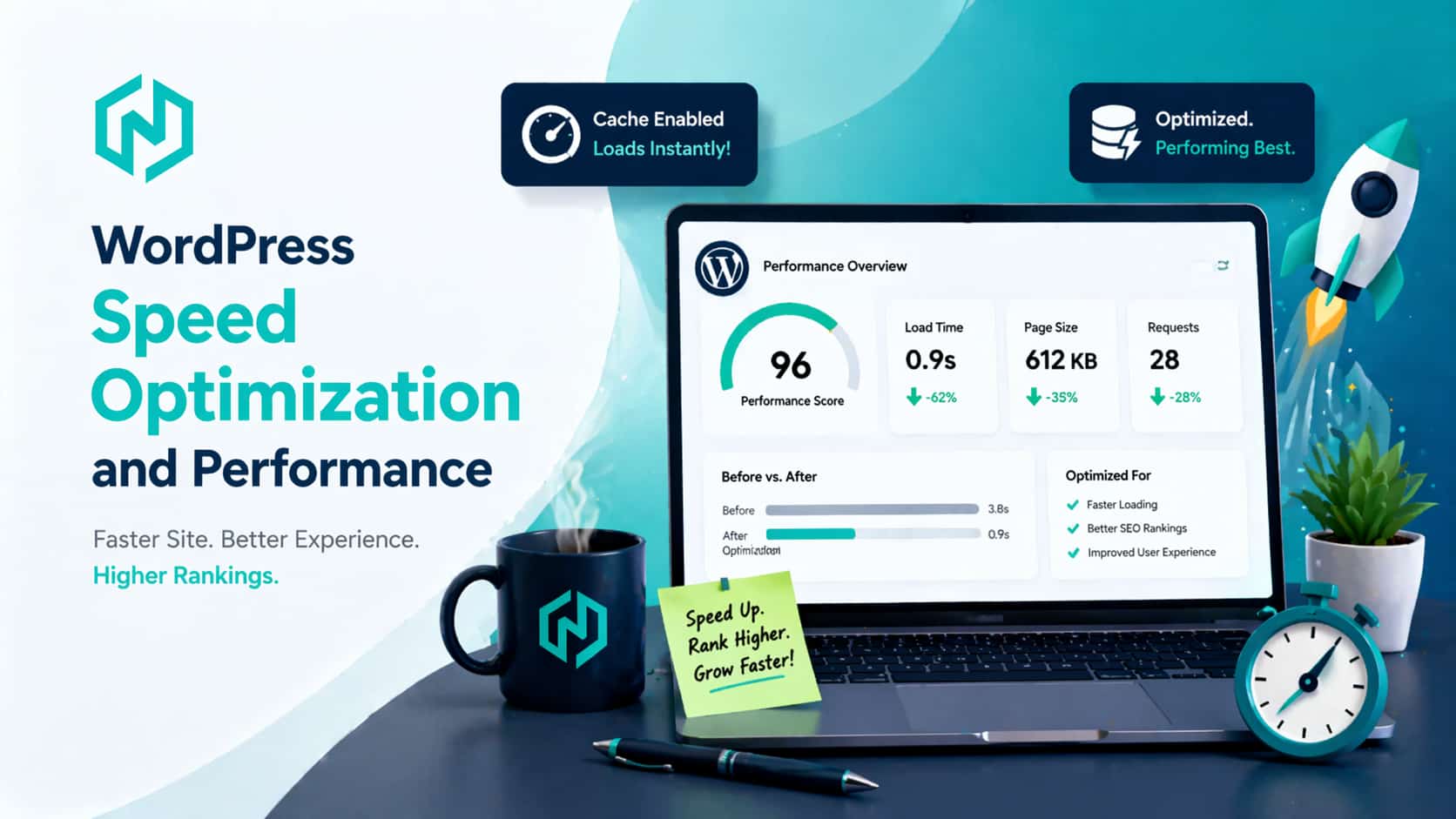
- Fast loading and stable pages
Google recommends strong Core Web Vitals, including LCP within 2.5 seconds and INP below 200 milliseconds, because these reflect real world loading and responsiveness. Speed alone will not guarantee rankings or conversions, but poor speed makes everything else harder.
- Focused CTAs
A CTA should match the intent of the page. A homepage may invite a consultation. A service page may invite a quote. A blog may invite the next relevant step. If every page shouts a different thing, the site feels chaotic. If the CTA is too early or too vague, conversions suffer.
- Better form design
Forms are often where interest turns into action or gets lost. web.dev’s guidance on forms stresses meaningful labels, stable fields, validation during entry, and reducing friction. That is especially important for lead generation pages and ecommerce checkouts. A form that feels easy earns more trust than one that feels like work.
- Relevant content around the offer
Design without content is just layout. High converting pages explain the problem, show the solution, handle objections, and prove results. This is where many sites look nice but fail. They do not answer the buyer’s next question.
- The right build for the business model
A service company may need fast lead pages, booking flows, and case study templates. An ecommerce brand may need shopify store development services that support product storytelling, cleaner collections, faster mobile shopping, and smoother checkout paths. A B2B firm may need stronger forms, comparison pages, and long form trust building content.
A useful way to test your own website is to ask what the page is doing in each screen section. Is it clarifying, proving, reassuring, or guiding. If a section does none of those, it may just be visual filler.
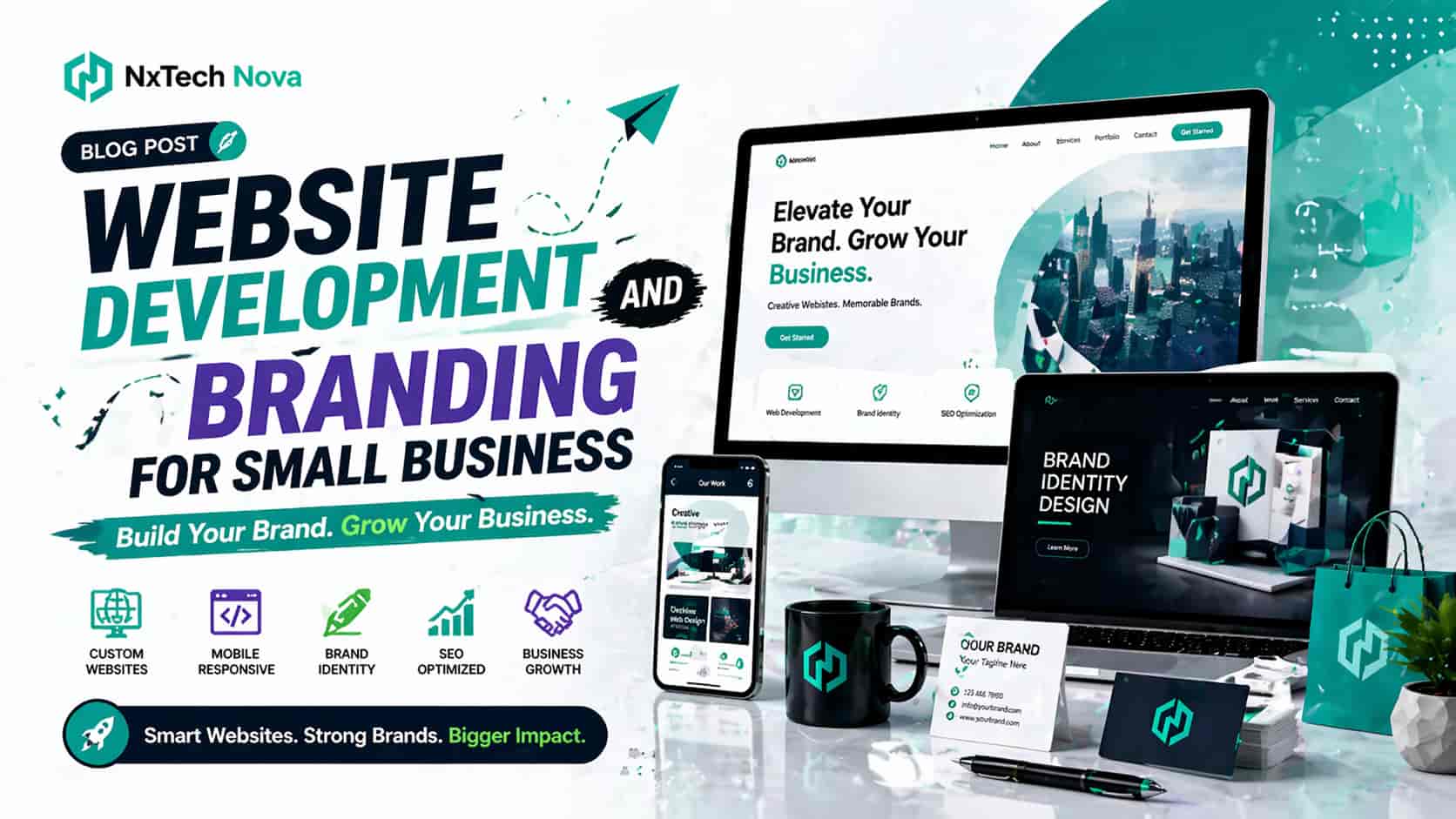
How to build your website's digital presence with a unique look?
A unique digital presence is not created by using unusual colors or fancy animations alone. In fact, many websites become less memorable when they chase novelty without clarity. What makes a site stand out is the combination of clear brand identity and a distinct but usable experience.
Start by deciding what kind of memory you want to leave. Do you want visitors to remember your clarity, your warmth, your precision, your premium feel, or your creativity. That memory goal should influence the look and structure of your site.
Then build consistency across the places where people discover you. Your website should feel connected to your search appearance, your social content, your email style, your landing pages, and your sales materials. When the same tone and visual logic show up everywhere, people start recognizing you faster.
This is where many brands accidentally weaken themselves. They use one style on the homepage, another on social media, another in ads, and another in the blog. The result is not variety. It is fragmentation.
To build a stronger digital presence, focus on these five areas.
- Own a recognizable design language
Your layouts, card styles, icons, buttons, spacing, image treatment, and typography should be distinctive enough that a visitor can begin to recognize your brand even before reading the logo.
- Develop a brand voice that sounds human
If your website uses stiff, generic copy, even good visuals will not save it. A unique site sounds like a real company speaking clearly to real people. It does not sound copied from every other agency page in the market.
- Show proof that looks and feels current
Old screenshots, outdated testimonials, and thin case studies quietly damage trust. NN Group highlights the importance of comprehensive and current content in how users judge trustworthiness. In practice, that means your content must look alive, not abandoned.
- Build signature pages, not just standard pages
Your homepage matters, but your About page, work pages, service pages, industry pages, and blog pages also shape identity. Even a strong About summary can help build trust because people who trust you are more willing to engage further.
- Customize the experience to the audience
A luxury brand in London may need a darker, more restrained visual tone. A local business may need warmth, simpler wording, and clearer calls. A real estate platform in Riyadh may need bilingual support with an experience that respects both Arabic and English reading patterns. A healthcare product may need extra clarity, security signals, and compliance friendly flows. A unique presence comes from fit, not from decoration.
If your current site feels like a template wearing your logo, you may need custom web development near me rather than another round of surface edits. A custom approach can shape the structure, storytelling, and interface around your actual market instead of forcing your brand into a generic pattern.
Digital presence also grows through content. When your blog, service pages, and case studies all speak with the same voice and support the same buyer journey, your website starts doing more than presenting information. It starts building familiarity. That familiarity often becomes trust before a sales conversation even begins.
A unique website also has to remain usable. Do not confuse uniqueness with friction. Visitors should still know where to click, how to move, and what to do next. The best creative websites are memorable because they balance identity with clarity, not because they hide basic actions behind clever design tricks.
What is the importance of user experience (UX) in on-page SEO?
UX matters in on page SEO because search success does not end when someone lands on your page. The experience on the page affects whether the visit feels satisfying, whether the content is easy to understand, and whether the user continues deeper into the site.
Google’s own documentation says SEO is about helping search engines understand your content and helping users find your site and decide whether they should visit it. Google also advises people first content and says its systems look to reward content that provides a good page experience. That means UX and on page SEO support the same end goal more than many businesses realize.
Here is how UX strengthens on page SEO in practical terms.
- Better readability improves content usefulness
If your text is cramped, your headings are weak, and your pages feel hard to scan, people leave faster. Good UX makes content easier to digest through structure, spacing, section flow, and clear hierarchy. That helps users reach the answer they came for.
- Strong mobile design protects the page experience
Google explicitly asks whether pages display well on mobile devices as part of page experience self assessment. Responsive design also improves access for more users, including people who zoom text or rely on different browsing conditions.
- Speed supports both satisfaction and search visibility
Google recommends good Core Web Vitals because they measure loading performance, responsiveness, and visual stability in the real world. If a page loads slowly or shifts around while a user is trying to interact with it, trust drops. Search visibility can suffer too when many relevant pages compete for the same query.
- Clear page structure helps users and search engines
A page with a useful title, logical headings, and sections that answer the right questions is easier for people to scan and easier for search engines to understand. This is where design and content meet. A visually attractive page that hides the main answer below fluff is not helping anyone.
- Navigation supports discovery
Internal links and clear menus help users reach related pages naturally. Google’s SEO guide also points out that links connect users and search engines to other parts of the site and are crucial for discovery. Good UX turns internal linking into a useful journey instead of a random set of links.
- Forms and interaction design affect conversions from search
A blog post that ranks well but leads into a confusing form wastes opportunity. A page that gets traffic but makes action feel difficult is only half optimized. If you are investing in seo services near me, this is one of the first truths to remember. Rankings alone do not build revenue. User experience helps turn visibility into results.
- Trust signals reduce bounce and hesitation
Users judge site credibility quickly. NN Group’s research shows that design quality, clarity, and current content all shape trust. When a page looks outdated, vague, or hard to use, people may leave before they ever discover the actual value of the content.
- Accessibility improves usability for more people
Accessible responsive design supports users who zoom, use assistive technology, or browse under different visual conditions. A site that works for more people is a stronger site overall. Accessibility is not separate from UX. It is part of quality.
The biggest mistake brands make is treating SEO like metadata work and UX like visual work. In reality, both should help the visitor get to the answer with less effort. If a page ranks but confuses users, it is underperforming. If a page looks beautiful but gives search engines little structure, it is also underperforming.
That is why on page SEO should include more than keyword placement. It should include clear headlines, fast loading assets, smart spacing, mobile friendly layouts, visible proof, usable forms, internal links that make sense, and content that actually answers the visitor’s next question.
Conclusion
Choosing the right website approach matters because your website is often the first real proof of your brand. It shapes first impressions, signals quality, influences trust, supports conversions, and helps search engines understand what your business offers.
A professional site does more than look modern. It connects branding, content, UX, speed, trust, and SEO into one experience that feels easy for visitors and valuable for the business.
If you want a partner that treats design as a growth asset instead of a decoration project, NxTechNova is the strongest place to start in this comparison. For businesses ready to move beyond templates and build something sharper, clearer, and more conversion focused, exploring a website design and development company near me that understands branding, structure, and performance can be the difference between having a website and having a real digital sales engine.